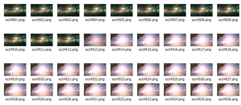
Some screen captures. A quick transition at 4512 frames in.
The academic multimedia publication WiderScreen had an interesting article about making story boards and weird “sliding window” visualizations of demoscene productions.
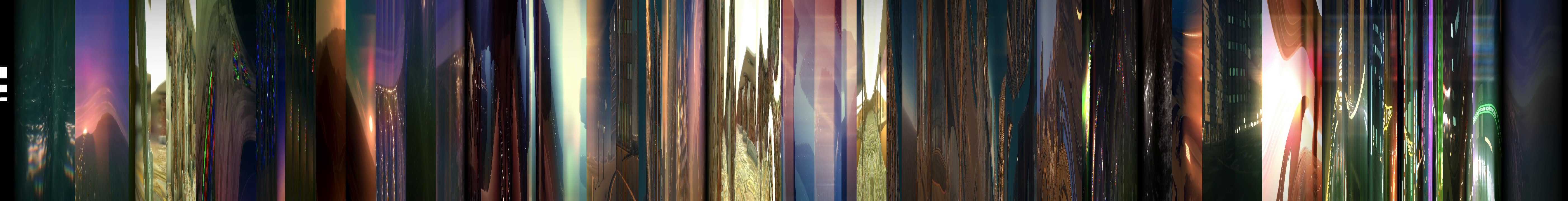
Let’s do one with “orthogonal YZ-projection” ourselves.
Download a video capture of the timeless by mercury and break it down to pieces. After the download we split the video into individual frames using ffmpeg:
ffmpeg -i "the timeless by mercury @ Revision 2014-lwFVlNytq0Q.mp4" -vf fps=15 captures\out%04d.pngThe option fps=15 sets the capture rate to 15 frames per second. This produces 5605 images.
Some screen captures. A quick transition at 4512 frames in.
With ImageMagick, a single image with 1280x720 dimensions can be cropped to a slice by extracting a 1x720 area of pixels like this:
convert image.png -crop 1x720+640+0 out.pngTo run this over a full directory of images on Windows we can write a batch script crop.bat that does this automatically.
for %%f in (%1\*.png) do ( convert.exe "%%f" -crop 1x720+640+0 "%2\%%~nf.png" )Run this with crop.bat captures slices where captures contains the original screenshots and slices is an empty directory for the generated pieces.
To append all these images we make another script: append.bat
for %%f in (%1\*.png) do ( convert.exe "%2" "%%f" +append "%2" )Before you run it, you should create a black 1x720 image file e.g. big.png to act as a starting point. After that run append.bat slices big.png and wait until the picture has been fully formed. It’s going to take a while since the process becomes slower as the target image grows. It would have been smarter to first join the images in e.g. batches of 100 and then join the resulting pictures together to form the final work.

A downscaled end result
Full 2.52 MiB PNG. The resulting 5607x720 image is already pretty interesting. We can make it easier for the eyes if we scale by 25% on the Y-axis.

Scaling on the Y-axis
In the full image strip the structure of the demo can be easily seen.
It would be fitting to add an audio waveform to the picture to see how the soundtrack matches the visuals. Let’s do that.
Extract the video soundtrack using ffmpeg:
ffmpeg -i "the timeless by mercury @ Revision 2014-lwFVlNytq0Q.mp4" timeless.wav Mix the audio to mono with sox:
sox timeless.wav timeless_mono.wav channels 1 We can generate a spectrogram of the song with
sox timeless_mono.wav -n spectrogram -r -l -x 5507 -Y 720 -o wave.png-n spectrogram create a spectrogram visualization-r output only the spectrogram data-l use a light background-x 5507 total width in pixels-Y 720 vertical pixels per sample
Audio spectrogram.
Hey, pretty cool!
A waveform view might be even better, so let’s try to make a picture with sox and gnuplot.
Gnuplot makes pictures of plaintext data (and possibly binary too) so we need to convert the raw PCM audio to a text representation first. In order to speed up the process we first downsample the mono audio to the sample rate of 4410 Hz.
sox timeless_mono.wav -r 4410 timeless_downsampled.wav downsample 1000 Then the conversion to a plaintext format follows:
sox timeless_downsampled.wav -t dat - > timeless.values.txt timeless.values.txt looks roughly like this:
; Sample Rate 4410
; Channels 1
               0                0
   0.00022675737   3.0517578e-005
   0.00045351474   3.0517578e-005
   0.00068027211   3.0517578e-005
   0.00090702948   3.0517578e-005
    0.0011337868   3.0517578e-005
    0.0013605442   3.0517578e-005
    0.0015873016   3.0517578e-005
     0.001814059   3.0517578e-005
    0.0020408163   3.0517578e-005

... and so on ...
It’s time to fire up wgnuplot.exe that ships at least with the GNU Octave Windows releases. A simple waveform plot can be written by setting the terminal size to the wanted dimensions and then using the plot command to trun the data into pixels.
Here’s the command history that generated the graph below.
Terminal type set to 'wxt'
gnuplot> set terminal png size 5507,720 enhanced
Terminal type set to 'png'
Options are 'nocrop enhanced font "arial,12" fontscale 1.0 size 5507,720 '
gnuplot> set output "E:\\temp\\output.png"
gnuplot> set lmargin 0
gnuplot> set rmargin 0
gnuplot> set tmargin 0
gnuplot> set bmargin 0
gnuplot> plot "E:\\temp\\videos\\timeless.values.txt" using 1:2 every 50 with lines lc rgbcolor "#000080"
gnuplot> 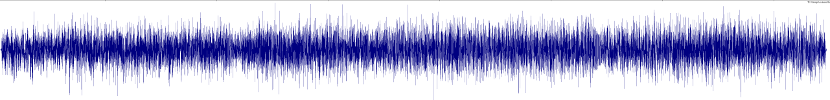
An ugly waveform.
The output is a bit disappointing and I couldn’t make it look significantly better by tweaking the downsampling and plotting settings.
If you still want to pursue this technique, you should take a look at this helpful discussion on the sox developers mailing list.
Audacity can print waveforms so we can save it’s output to a file using a virtual PDF printer.
To export a PDF file, simply pick File > Print… from the menu. Make sure your virtual printer is set to landscape mode.
ImageMagick is capable of rendering PDF documents - in theory - but in this case it crashed with error %%[ Error: invalidaccess; OffendingCommand: put ]%%
GIMP knows how to open PDFs and it seems to work quite well.
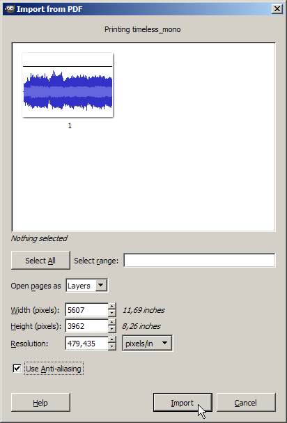
The width is the same as in the generated picture.
The result is already much better:

Rescaled and cropped Audacity print output.
The last step is to combine the images. I did this in GIMP and used a 320 kbps version of the soundtrack exported with a dark backgroundf from sox.
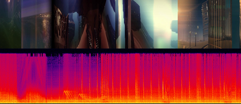
The full plot with a spectrogram (5607x360 JPG)
The full plot with a waveform (5607x360 JPG)
It’s clear that the spectrogram conveys much more information than the waveform does.
Some ideas that could be interesting to try out: